

Material Design UI: A Practical Guide to Building Better Frontend Experiences
Material Design UI: A Practical Guide to Building Better Frontend Experiences
Learn how Material Design helps frontend developers and UI/UX designers create consistent, accessible, responsive, and scalable digital experiences.
Frontend
September 13, 2026

Kabin Hasan
Software engineer specializing in PHP and Laravel, with a focus on building reliable, scalable web applications and backend systems. His expertise spans application development, API integration, database-driven solutions, and modern software engineering practices. At Polygon Technology, he contributes to developing robust digital products while maintaining clean, maintainable, and efficient code.
Good UI is not simply about making an application look attractive. It is about helping users understand what they can do, complete tasks efficiently, and move through an interface without unnecessary friction.For frontend developers and UI/UX designers, that means building more than individual screens. It means creating a consistent visual and interaction system that users can understand from their first interaction.This is where Material Design becomes valuable.Material Design provides a structured approach to typography, color, layout, components, motion, accessibility, and responsive interfaces. Instead of making every design decision from scratch, teams can work from a shared set of principles and patterns.In this guide, we’ll explore what Material Design UI means, why it matters for frontend development, how to approach it as a design system, and how tools such as Material Theme Builder can help teams create consistent interfaces.
What Is Material Design?
Material Design is Google’s design system for creating digital interfaces with consistent visual language, interaction patterns, and usability principles.
It is much broader than a collection of pre-built buttons, cards, dialogs, and navigation components.
The system covers areas such as:
- Color and theming
- Typography and visual hierarchy
- Layout and spacing
- Components and interaction states
- Responsive and adaptive interfaces
- Motion and transitions
- Accessibility
- Navigation and information structure
The goal is to create interfaces that feel familiar and predictable while still allowing products to maintain their own visual identity.
Material Design’s original principles were built around typography, grids, space, scale, color, imagery, and motion as tools for creating hierarchy and focus.

Why Material Design Matters for Frontend Development
Frontend development is not just about converting a design file into HTML, CSS, or a component framework.
A frontend application needs to maintain consistency as it grows.
Imagine a product with 30 different screens. If every screen has its own button styles, spacing rules, colors, form states, and navigation patterns, the application quickly becomes difficult to maintain.
A design system solves that problem by establishing reusable rules.
Instead of asking:
How should this button look?
on every screen, the team can define a button once and reuse the same visual and interaction rules throughout the product.
This provides several practical benefits:
- Faster development
- Reusable components
- More consistent interfaces
- Easier maintenance
- Better collaboration between designers and developers
- More predictable user interactions
- Stronger accessibility foundations
For frontend teams, consistency is not merely a visual benefit. It also reduces the amount of duplicated decision-making required during development.
Material Design Is a System, Not Just a Component Library
One of the most common misconceptions about Material Design is that it simply means using Material buttons, cards, menus, and dialogs.
Those components are only the visible part of the system.
A strong Material Design implementation also considers:
Visual hierarchy
Users should be able to distinguish primary actions, secondary information, supporting content, and navigation without having to study the screen.
Spacing
Consistent spacing creates relationships between elements and prevents interfaces from feeling crowded or disconnected.
Typography
Typography establishes hierarchy between headings, body content, labels, supporting information, and actions.
Color
Color can communicate hierarchy, interaction states, emphasis, and system feedback.
Motion
Transitions can help users understand changes in state and maintain continuity as elements appear, disappear, or transform.
Accessibility
A good interface should remain understandable and usable for people with different visual, motor, cognitive, and assistive-technology needs.
Material Design’s accessibility guidance emphasizes clear hierarchy, sufficient contrast, meaningful labels, focus behavior, and support for assistive technologies. (Material Design)
Think in Design Systems, Not Individual Screens
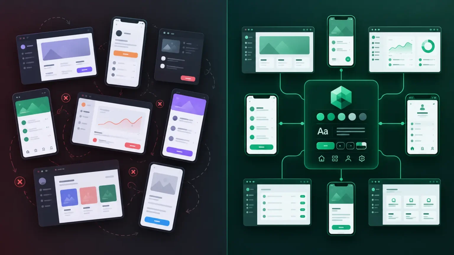
A common mistake in product development is treating every screen as an isolated design problem.
A better approach is to think about the product as a system of connected experiences.
Consider a banking application.
It might contain:
- Login
- Dashboard
- Account details
- Money transfer
- Transaction history
- Notifications
- Profile
- Settings
Each screen has a different purpose, but the product should still feel like one application.
The same navigation patterns should behave consistently. Buttons should communicate the same types of actions. Forms should follow predictable interaction patterns. Typography and spacing should establish the same visual hierarchy.
This is where a design system becomes more valuable than a collection of individual mockups.
Use Familiar Patterns to Reduce Cognitive Load
Users bring expectations with them.
A search icon suggests search. A navigation menu suggests navigation. A back arrow usually takes users toward the previous location. A familiar form layout tells users where information belongs.
These conventions reduce the amount of explanation an interface needs.
Think about a supermarket. You do not need to learn an entirely new navigation system every time you visit a different branch. Signs, aisles, product groupings, and checkout areas follow familiar patterns.
Digital interfaces benefit from the same principle.
A user should not have to relearn how navigation, forms, buttons, or feedback work every time they move to another screen.
Material Design provides established patterns that help teams maintain these expectations across an application.
That does not mean every Material-based product needs to look identical. The design system provides the foundation while teams can adapt the visual language to their brand and product requirements.
Build a Design Theme Before Building Every Screen
One of the easiest ways for a product’s UI to become inconsistent is to choose styles one screen at a time.
A developer creates one shade of green for the dashboard, another for the settings page, and a slightly different version for buttons.
The same thing happens with typography, spacing, borders, elevation, and component states.
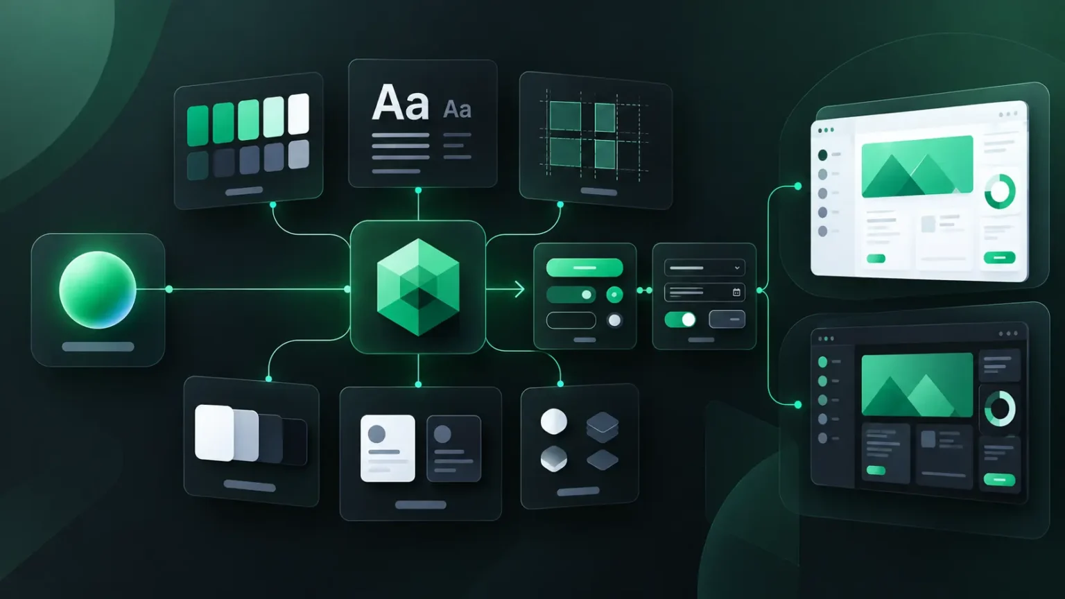
Instead, establish the design foundation first.
Define:
- Primary and secondary colors
- Surface and background colors
- Typography hierarchy
- Spacing scale
- Component shapes
- Elevation rules
- Button states
- Form states
- Light and dark themes
- Responsive behavior
Once those foundations exist, individual screens become implementations of the system rather than independent design decisions.
Use Material Theme Builder to Create a Consistent Foundation
Creating an entire theme manually can take considerable time, particularly when a product needs both light and dark modes.
Google’s Material Theme Builder provides a practical starting point.
You can begin with a seed color and generate a broader Material color system that can be used as the foundation for an interface.
This makes it easier for designers and developers to start from the same visual foundation instead of manually choosing colors for individual components.
Try the Material Theme Builder
The tool should not replace design judgment. A generated palette still needs to be reviewed against the product’s branding, accessibility requirements, content, and interaction states.
But it can dramatically reduce the repetitive work involved in creating a starting theme.
Responsive Design Is Part of the System
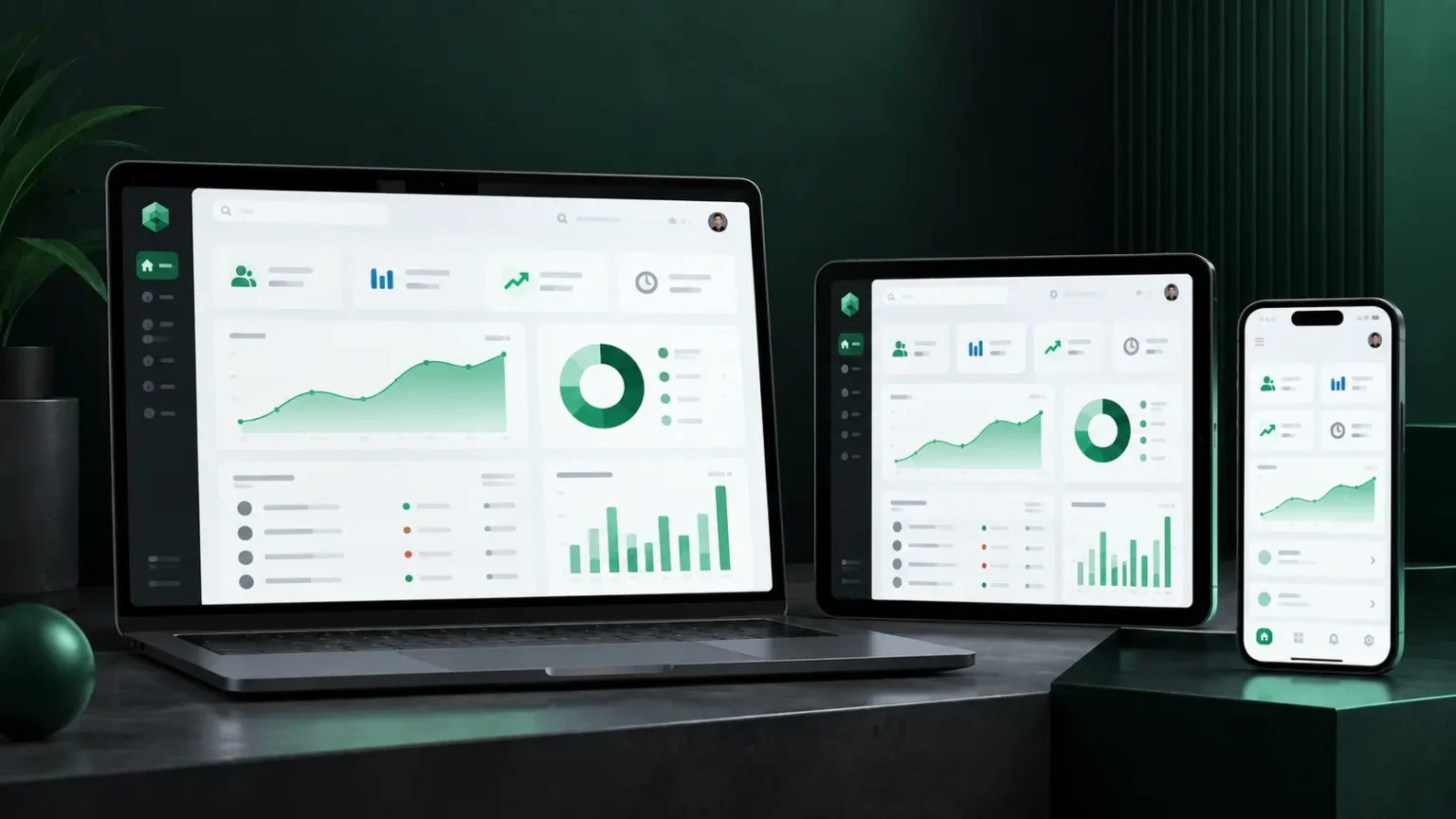
A modern UI cannot be designed only for one screen size.
Users may access the same product from:
- Mobile phones
- Tablets
- Laptops
- Desktop monitors
- Large displays
A responsive interface should not simply shrink everything when the viewport becomes smaller. Content, navigation, spacing, and component arrangements may need to change.
Material Design’s responsive guidance uses grids, breakpoints, reflow, expansion, and repositioning to help interfaces adapt to different screen sizes. (Material Design)
For example, a desktop dashboard might display navigation, summary cards, and detailed information side by side. On a smaller screen, the same information may need to become a vertically ordered experience.
The goal is not to preserve the exact desktop layout.
The goal is to preserve the user experience and information hierarchy.
Accessibility Should Be Designed From the Start
Accessibility should not be treated as a final checklist before launch.
It should be part of the design system from the beginning.
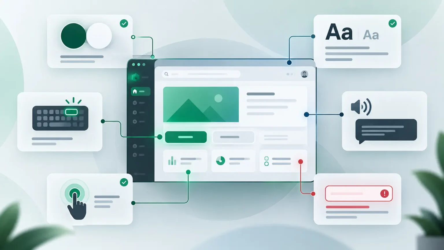
Important considerations include:
Color contrast
Text and interactive elements need sufficient contrast against their backgrounds.
Keyboard navigation
Users should be able to navigate important interactions without relying exclusively on a mouse or touchscreen.
Focus states
Keyboard and assistive-technology users need clear indications of where focus currently resides.
Touch targets
Interactive controls need enough physical space to be comfortably used.
Meaningful labels
Icons and controls should communicate their purpose clearly to users of assistive technologies.
More than color
Important states should not be communicated through color alone. Error, success, warning, and selection states can also use text, icons, shapes, or other visual indicators.
Material Design’s accessibility guidance specifically recommends combining color with other cues and maintaining clear hierarchy, focus, labeling, and sufficient contrast.
Designers and Frontend Developers Should Share the Same System
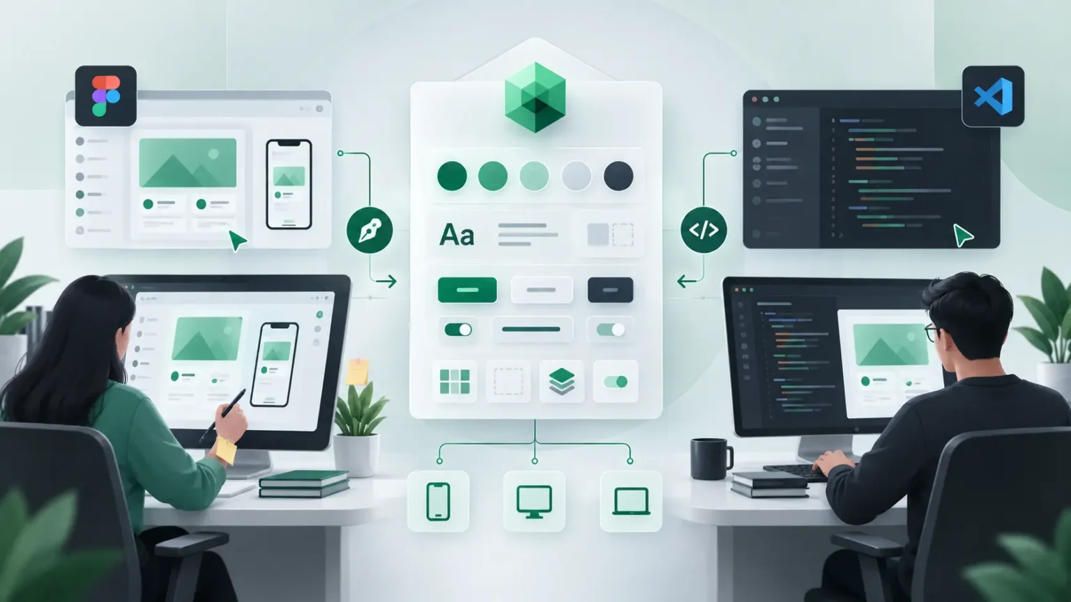
A design system becomes especially powerful when designers and developers use the same language.
Without a shared system, the workflow often looks like this:
Designer creates screen → Developer interprets design → Differences appear → Designer reviews → Developer adjusts → More differences appear
A shared design system reduces this translation gap.
Designers can define reusable patterns, while frontend developers implement those patterns as reusable components.
For example, a design system might define a button’s:
- Size
- Typography
- Color
- Border radius
- Padding
- Hover state
- Focus state
- Disabled state
- Loading state
The developer can then implement those rules as a reusable component rather than recreating the button independently on every page.
This makes the relationship between design and frontend development much more efficient.
Material Design and Brand Identity Can Work Together
Using a design system does not mean sacrificing brand identity.
Material Design provides a foundation, but a product still needs its own personality.
A financial platform might use a restrained visual language that emphasizes trust and clarity.
An education platform might use more expressive colors and illustrations.
A SaaS dashboard may prioritize information density and productivity.
The same underlying design principles can support all three.
The key is to customize the right layer.
Keep foundational principles such as hierarchy, accessibility, consistency, responsive behavior, and predictable interaction patterns.
Then adapt elements such as:
- Brand colors
- Typography
- Imagery
- Illustration style
- Component shapes
- Content tone
- Visual density
This creates a product that feels distinctive without sacrificing usability.
Avoid Overdesigning the Interface
A design system can provide many components and possibilities, but that does not mean every screen needs to use all of them.
Good UI is often about removing unnecessary complexity.
Ask:
- Does this element help the user complete a task?
- Is this action actually necessary?
- Can the hierarchy be understood immediately?
- Is the screen too visually dense?
- Does animation communicate something useful?
- Are there too many competing primary actions?
Material Design’s principles emphasize hierarchy, focus, and meaningful interaction rather than decoration for its own sake. (Material Design)
A polished interface should feel intentional, not crowded.
A Practical Material Design UI Workflow
For teams starting a new frontend project, a simple workflow can make implementation much more consistent.
1. Define the product goals
Understand the users, their tasks, and the most important interactions before designing individual screens.
2. Establish the visual foundation
Define colors, typography, spacing, shapes, elevation, and interaction states.
3. Create reusable components
Build common elements such as buttons, inputs, cards, dialogs, navigation, tabs, and feedback states.
4. Define responsive behavior
Decide how components and layouts should adapt across mobile, tablet, and desktop experiences.
5. Validate accessibility
Check contrast, focus states, keyboard navigation, labels, touch targets, and other accessibility requirements.
6. Build screens from the system
Once the foundation is ready, individual screens become compositions of reusable components.
7. Test with real users
A design system can provide consistency, but usability still needs to be validated with real people and real tasks.
This workflow turns Material Design from a collection of visual guidelines into something much more useful: a repeatable product development process.
Conclusion
Great frontend experiences rarely come from making every screen unique.
They come from making the entire product feel connected.
Material Design gives teams a practical foundation for creating that consistency through reusable components, structured layouts, typography, color, responsive behavior, accessibility, and meaningful interaction patterns.
For frontend developers, this can mean cleaner architecture and more maintainable interfaces. For UI/UX designers, it provides a shared system for turning ideas into predictable experiences. And for users, the result is an interface that feels easier to understand from the moment they encounter it.
The best UI does not constantly ask users to figure things out.
It quietly gives them the patterns they already know, then gets out of their way.
We use cookies to ensure that we give you the best experience on our website. If you continue to use this site we will assume that you are happy with it.AcceptPrivacy policy